Design Project - Managing DJ-Transitions
- August 2019

The maintenance of the server was a little too much for me. It's currently being bombarded with robot entries that pass the "I'm not a robot" test.
mix-base.comIn summer 2018, I DJed/ made some music with my friends and realized that I forgot DJ transitions between two songs that worked very well together. I played a song and forgot the other song that fit the song I played. Since then, I started talking to my DJ friends in Germany and the USA about potential solutions to this problem:
- Notebooks
- Spotify Playlists
- Sticky Notes
- Pure Brain Memory
- Databases
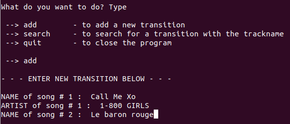
In Fall 2018, I developed my first prototype that saved DJ transitions in an SQLite database. However, it was highly inaccessible to my friends and difficult to use. It only ran on a Linux machine and I had to navigate it through the command-line.
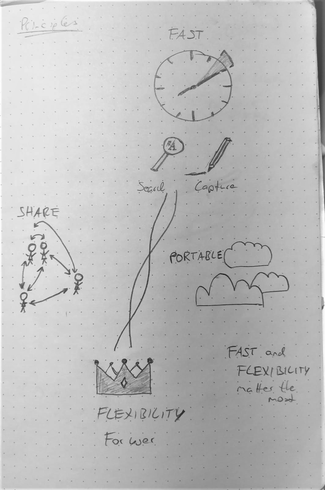
During my spring 2019 semester, I had the great opportunity to do some design work with Ela Ben-Ur. Besides learning a lot about life and myself, I used Ela’s Innovators Compass to reconsider the MixBase project as a whole. I started from zero, and with the aid of Ela and the compass, I restructured my thoughts on the goals of this project. After some exploration, I was fairly certain that the principles this project lived by were: fast capturing and searching of transitions, flexible ways of saving transitions, portability, and an easy way of sharing transitions with friends.
The Simple but Powerful Solution
I reconsidered my coding approach and thought of ways to satisfy the same principles that didn’t include any coding: sticky notes, Excel tables, various kinds of notebooks. This crucial design step made me understand that I had tried to fit the idea to the tool (coding). However, I had to be the other way around! A tool should always serve the idea. It was a common engineering mistake that I made. I used complicated tools to solve a problem that asked for potentially much simpler solutions.
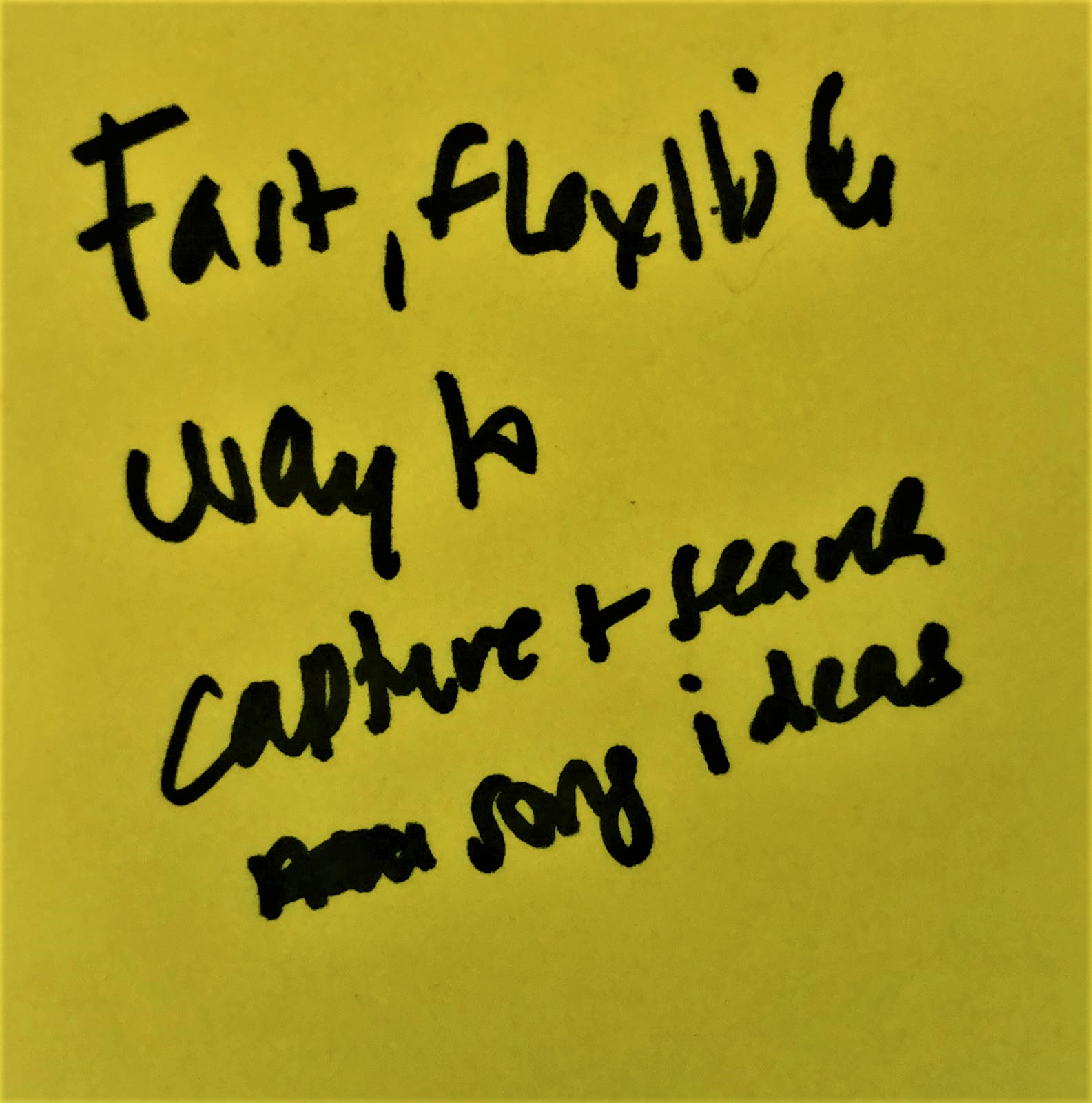
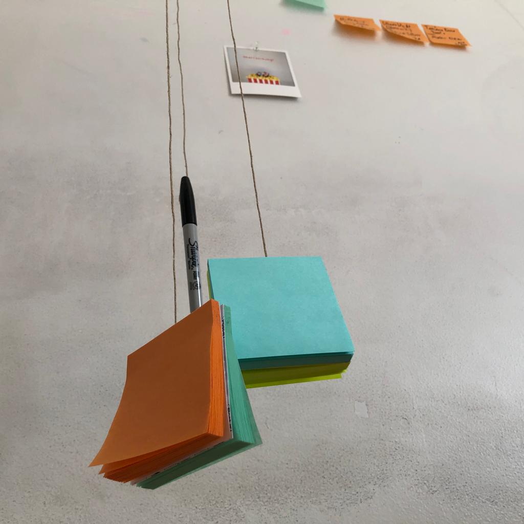
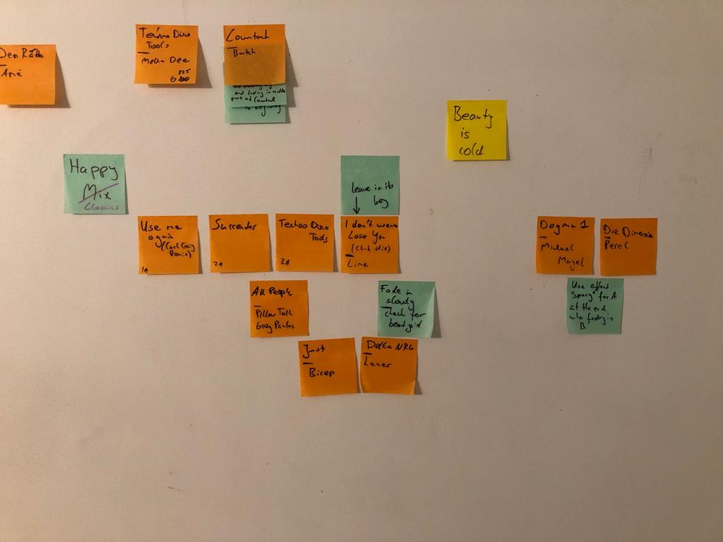
Notebooks seemed very flexible. However, their accessibility was low as it required an even subsurface to write on. Eventually, I hung extra-grippy sticky notes and a sharpie from my ceiling in my dorm room. Whenever I came up with a good new song, I stuck a sticky note with the name of the song, artist, and anything else that I considered important on my wall. This modest physical solution allowed me to organize my thoughts freely. It was the perfect temporary solution for what I needed. Sadly, it was impossible to share the DJ-ideas on my wall with anyone else.
Web App Design
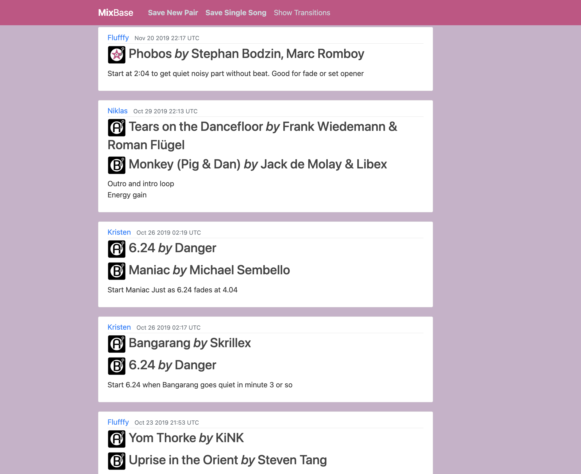
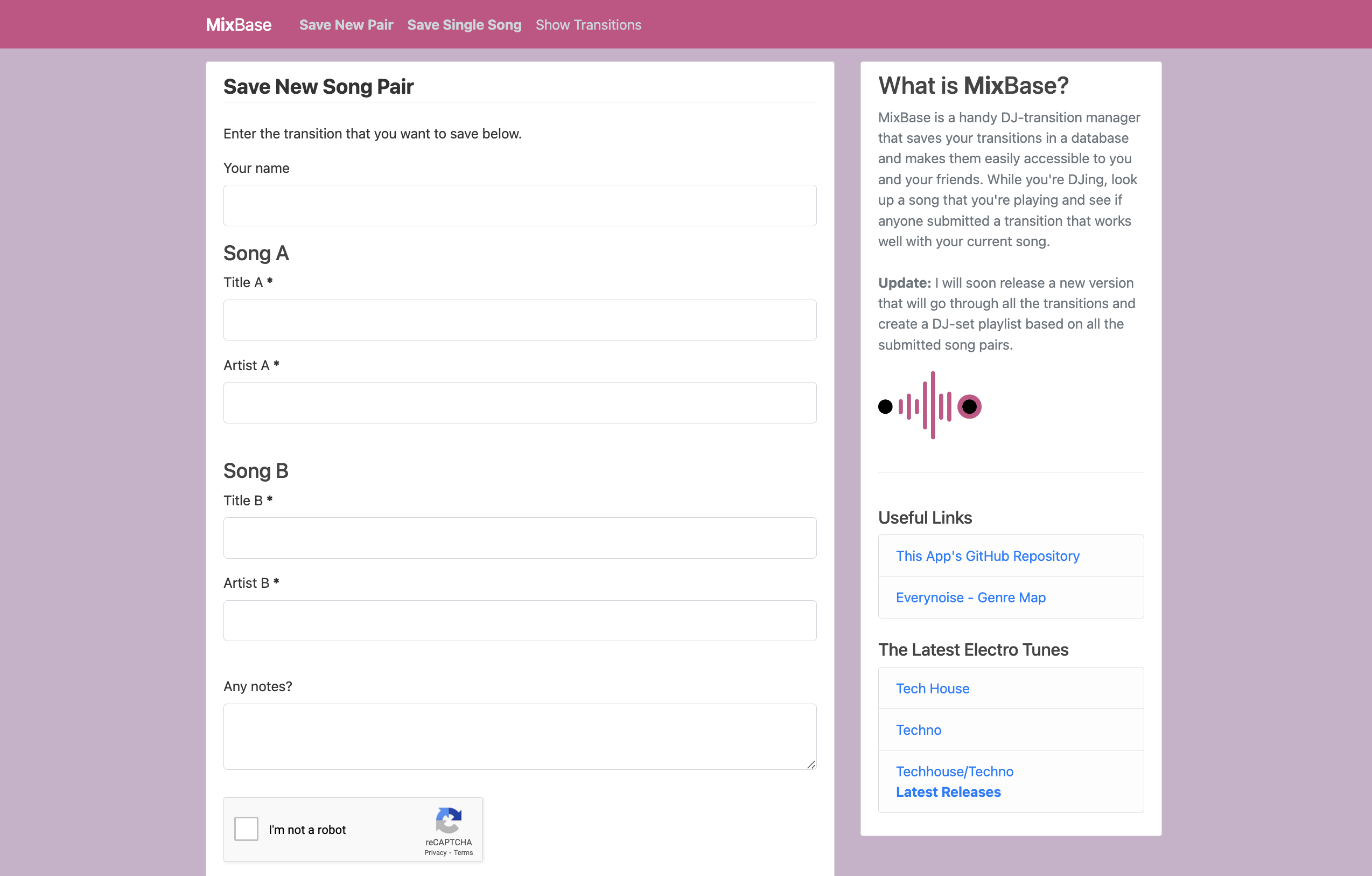
Even though sticky notes worked perfectly fine for me, I wanted to create a website that served a similar purpose. In summer 2019, I started to design a web app called MixBase. Please note that I had zero experience in web app development and the current version is still not fully developed. I chose this project not only because it seemed to be a good solution to my problem, but because I wanted to learn more about web app development. While designing the web app, I ran into common design issues. As I spent so much time on this “product”, I started to confuse change with improvement. I mulled certain aspects over and over again and felt the need to change them. Afterward, however, I realized that most design changes were overhasty and I had to backtrack. Lesson learned.
Here is one of the many design decision I had to make: I added a feature to save the genre of a song in case the user sought to do so. I decided to place the genre field after the submit button. This design choice served two purposes: Users were not distracted by the additional field, and the layout on most laptops fit perfectly such that the submit button was right at the end of what was visible on the screen.
For a while, I only used form validations that showed up after one had clicked the submit button. Soon I understood that I had to match my users’ standards, which was an insight in the spirit of: “99% of the websites that your users visit are not yours!” As a consequence, I added an asterisk to all necessary form fields.
